DDQ THU 2021-10-21
26. Color: Accessibility & Culture
26.1. Agenda
General Announcements
Discussion & Activity
Category |
Assignment |
Day |
Date |
|---|---|---|---|
Term Project |
FRI |
2021-11-05 |
26.2. Activity
26.2.1. Introduction
Contrast & Accessibility
Color is an important asset in design of Web content, enhancing its aesthetic appeal, its usability, and its accessibility. However, some users have difficulty perceiving color. People with partial sight often experience limited color vision, and many older users do not see color well. In addition, people using text-only, limited-color or monochrome displays and browsers will be unable to access information that is presented only in color.
According to the Web Content Accessibility Guidelines (WCAG), content visible on the Web must meet certain criteria to be considered accessible. For example, here is one criteria governing the minimum color contrast ratio for text:
The visual presentation of text and images of text [must have] a contrast ratio of at least
4.5:1, except for the following:
Large Text: Large-scale text and images of large-scale text have a contrast ratio of at least
3:1;Incidental: Text or images of text that are part of an inactive user interface component, that are pure decoration, that are not visible to anyone, or that are part of a picture that contains significant other visual content, have no contrast requirement.
Logotypes: Text that is part of a logo or brand name has no contrast requirement.
—WCAG 2.1: Success Criterion 1.4.3 Contrast (Minimum)
- contrast ratio
(L1 + 0.05) / (L2 + 0.05), whereL1is the relative luminance of the lighter of the colors, andL2is the relative luminance of the darker of the colors.
- relative luminance
R * 0.2126 + G * 0.7152 + B * 0.0722, whereR,G, andBare the normalized (between 0 and 1) red, green, and blue components of a color in the RGB color model.
The formulas provided above can be tedious to implement correctly in many cases since colors are seen expressed in different ways (hue, RGB value, HSL value, etc.). The “developer mode” of most web browsers can be used to determine contrast ratios for text on a web page. The Contrast Ratio website is also a good option.
Color Blindness
People with color blindness see colors differently than most people.
- color blindness
The decreased ability to see color or differences in color.

Fig. 26.1 An Ishihara color test plate. With properly configured computer displays, people with normal vision should see the number “74”. Viewers with red-green color blindness will read it as “21”, and those with total color blindness may not see any numbers. – https://en.wikipedia.org/wiki/Color_blindness
Color, Psychology, Emotion, and Culture
Wegman and Said (2011) [color:1] discus how different colors can evoke different emotions or result in different impressions. Here are some mappings drawn from various sources that are primarily based on Western culture:
- urgency
- passion
- heat
- love
- blood
- wealth
- royalty
- sophistication
- intelligence
- spirituality
- truth
- dignity
- power
- coolness
- melancholy
- formality
- death
- rebellion
- strength
- evil*
- emptiness
- lightness
- clean
- honest
- pure*
- warmth
- cowardice
- brightness
- creativity
- cheer
- nature
- health
- money
- cheerfulness
- quality
Remember, the information presented above is based on Western cultures. For example, in many Western cultures, white is associated with purity and hope; however, in some Asian culures, white is associated with death and bad luck.
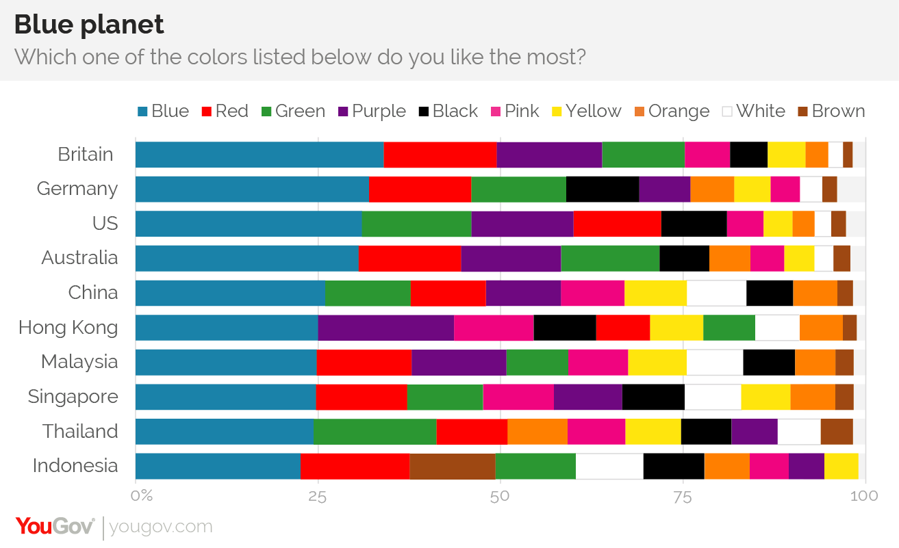
Favorite Color
A survey conducted by YouGov reveals that blue is the most popular color in 10 countries across four continents – including China.
Resources
You may find the following resources useful:
26.2.2. Breakout Groups
N/A.
26.2.3. After Breakout Groups
N/A.
26.2.4. After Class
Before 11:55PM today, individually respond to the prompt(s) below in Piazza @80.
1. Color & You
Create a followup post to Piazza @80 that answers the following questions:
What is your favorite color and why?
What is an example of a color-related design issue that either you or someone you know has faced? Why was it an issue? What steps can be taken to address that issue?
Before 11:55PM on SUN 2021-10-24 (Oct 24), individually comment on someone else’s followup discussion in Piazza @80.
Continue reading the Design and Practicum modules, and make sure you’re aware of current assignments and their due dates.
Suggestion: Consider reproducing an interface relevant to your term project as a mockup in Adobe XD or Figma.
2. Comments
Please keep the comments polite and constructive. In addition to whatever else you want to write, please comment on:
one or more aspects that you like or think is interesting; and
one or more aspects that you think needs improvement.
As always, please be sure to provide a brief justification for each.