DDQ MON 2020-11-16 @ 12:40 PM
35. Color & Design
35.1. Agenda
General Announcements
Paper presentation videos are now posted to eLC.
Tentative Roadmap
Day
Date
Event / Assignment
MON
11-16
Starting on 11-16 (today), all DDQs will be remote only.
TUE
11-17
Guest Speaker: Katie Kuntsevich, UX Designer, Gallup (formerly)
THU
11-19
Guest Speaker: Maja Culum, UX Architect, NCR Corporation
FRI
11-20
Homework 3: Conflict of Interest Training due via eLC
TUE
11-24
Last DDQ prior to Thanksgiving
THU
11-26
No Class: Thanksgiving Holiday
THU
12-03
MON
12-07
Last DDQ prior to Finals
Term Project: Milestone 4 Details Coming Soon
Activity
35.2. Activity
Color Theory
- color theory
A body of practical guidance to color mixing and the visual effects of a specific color combination.
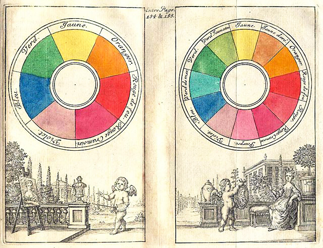
Fig. 35.1 Boutet’s 7-color and 12-color color circles from 1708
- color
The property possessed by an object of producing different sensations on the eye as a result of the way the object reflects or emits light. It is the perceptual characteristic of light described by a color name (i.e., a hue).
Any color can be described using the following attributes:
- hue
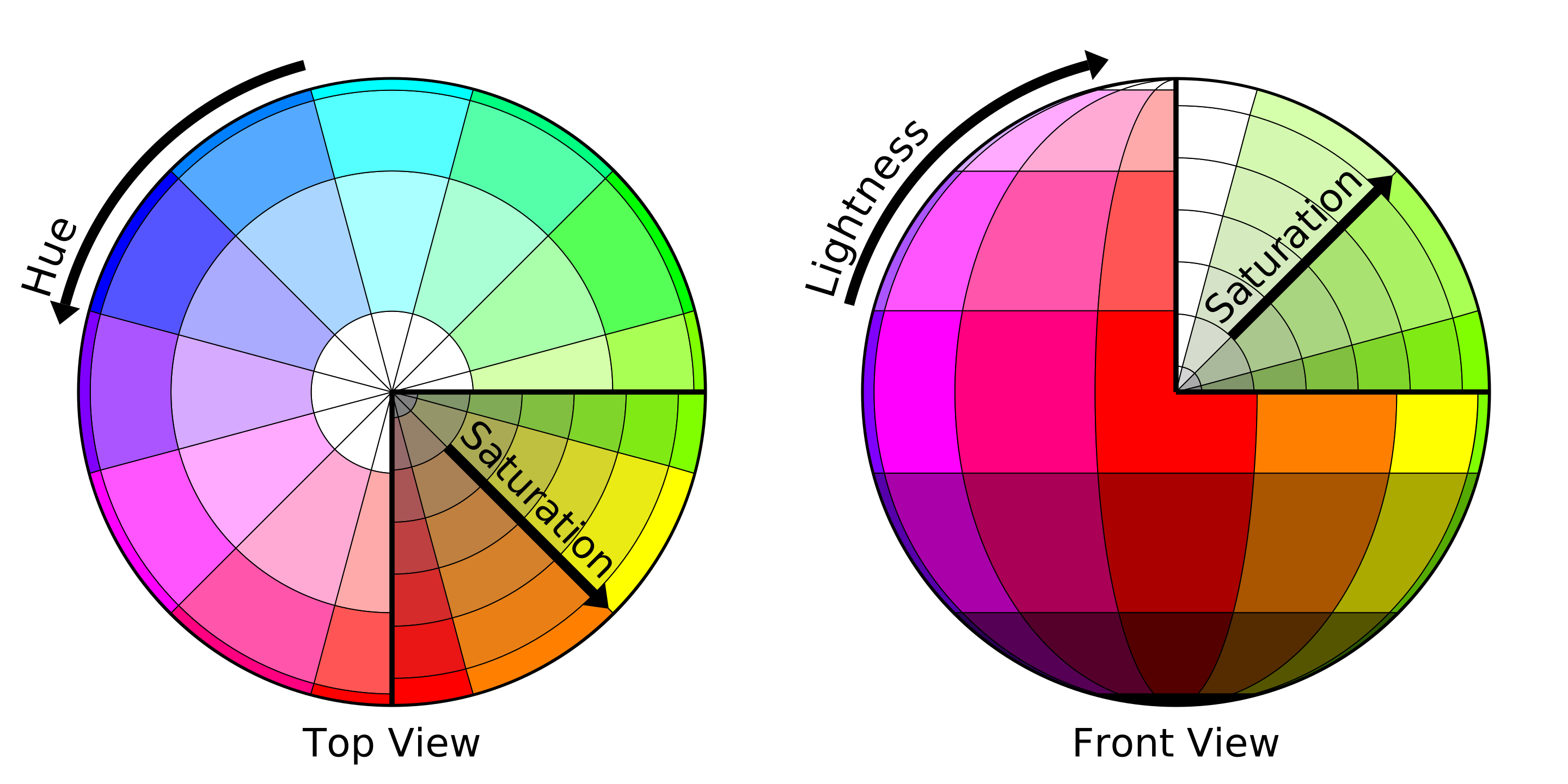
In most cases, the name of a color. Formally, it’s the degree to which a stimulus can be described as similar to or different from stimuli that are described as red, green, blue, and yellow, the so-called unique hues. You can also think of a hue as a slice of a color wheel.
- saturation
The intensity or strength of a color. Colors with high saturation appear bright, while those with low saturation appear dull.
- value
The relative lightness or darkness of a color. Related terms like contrast and gradient can be used to help define form and create spatial illusions.
When it comes to mixing colors, the following terms are often used:
- primary color
Traditionally, the colors red, yellow, and blue; however, these may differ by color model in modern use cases.
- secondary color
Traditionally, the colors green, orange, and purple; formed by mixing the primary colors. These may differ by color model in modern use cases.
- tertiary color
Traditionally, the colors yellow-orange, red-orange, red-purple, blue-purple, blue-green & yellow-green; formed by mixing a primary color and a secondary color. These may differ by color model in modern use cases.
If you mix a color with only white or only black, then the following terms are often used:
- shade
A hue or mixture of primary colors to which only black is added.
- tint
A hue or mixture of primary colors to which only white is added.
When it comes to picking colors for a design, the following terms are often used:
- color palette
- color scheme
A set of colors.
Here are the brand colors for the University of Georgia, taken directly from the UGA Brand Style Guide: Visual Style:
Arch BlackBulldog RedChapel Bell WhiteGlory GloryLake HerrickUsing color appropriately is one of the easiest ways to make sure our materials reflect a cohesive Georgia brand. Beyond our logo, color is the most recognizable aspect of our brand identity. The elements of our palette have been given names that reflect their inspiration. Using color appropriately is one of the easiest ways to make sure our materials reflect a cohesive Georgia brand.
—UGA Brand Style Guide: Visual Style
Related Terms
- primary color (in a scheme)
the color displayed most frequently in a design
- secondary color (in a scheme)
an optional optional color that is used sparingly to accent parts of a design
- color swatch
A sample of a color chosen from a range of similar colors.
- monochrome colors
Multiple colors consisting of various tints, shades, and saturations of a single base color; often used to create cohesive but potentially monotonous palettes.
- analogous colors
Three colors that are next to each other on a color wheel; such colors often match well and are used to create comfortable palettes.
- triadic colors
Three colors that are evenly spaced out on a color wheel; since there is no clear dominance of one color, such colors often match well without running the risk of looking too alike.
- complementary colors
Colors that are oppose each other on a color wheel; often used to differentiate foreground and background colors
- color model
An abstract mathematical model describing the way colors can be represented as tuples of numbers, typically as three or four values or color components. Here are some common models:
- RGBA color model
- RGB color model
An additive color model in which red (R), green (G), and blue (B) light are added together in various ways to reproduce a color. In the RGBA model, an alpha (A) value determines the opacity of a color relative to what’s behind it; it’s a number between 0.0 (fully transparent) and 1.0 (fully opaque). In digital works, the component values (i.e., R, G, and B) are often stored as integer numbers in the range
0to255, the range that a single 8-bit byte can offer. These are often represented as single hexadecimal numbers (two digits per component) or 3-tuples of decimal numbers.Name
Hex Code
Decimal Code
Red
#FF0000(255, 0, 0)Green
#00FF00(0, 255, 0)Blue
#0000FF(0, 0, 255)For RGBA values, an additional two digits are used in the hexadecimal representation and a fourth tuple component is used in the tuple representation.
Name
Opacity
Hex Code
Decimal Code
Red
0%
#FF000000(255, 0, 0, 0)Red
50%
#FF000080(255, 0, 0, 0.5)Red
100%
#FF0000FF(255, 0, 0, 1.0)- CYMK color model
A subtractive color model used in color printing. The CMYK model works by partially or entirely masking colors cyan (C), yellow (Y), magenta (M), and black (K) on a lighter, usually white, background. The ink reduces the light that would otherwise be reflected.
- HSLA color model
- HSL color model
HSL is an alternative representations of the RGB color model, designed in the 1970s by computer graphics researchers to more closely align with the way human vision perceives color-making attributes. HSL stands for hue (H), saturation (S), and lightness (L). HSLA color values are an extension of HSL with an alpha (A) value for opacity similar to RGBA.
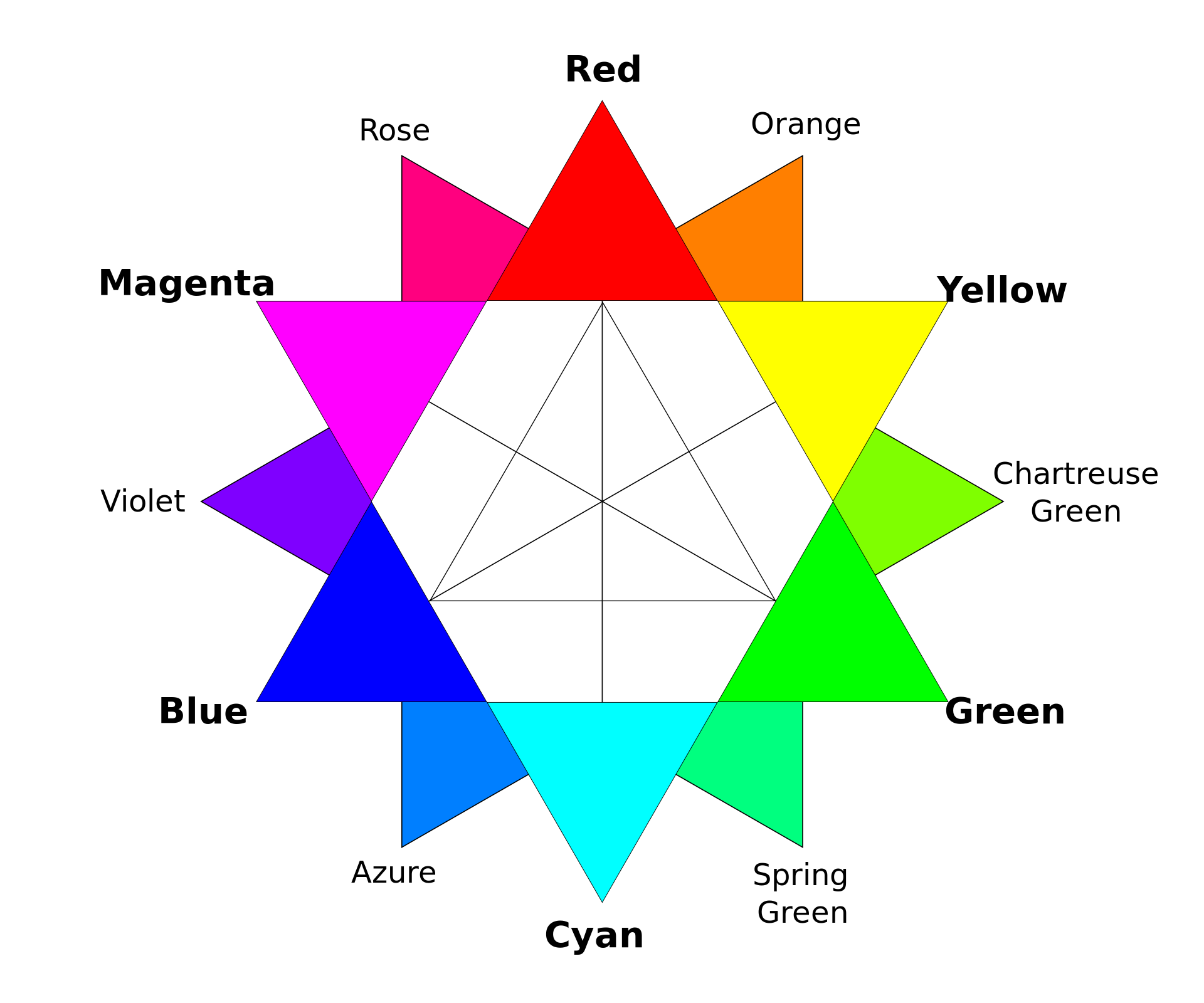
- color wheel
An abstract illustrative organization of color hues around a circle, which shows the relationships between primary colors, secondary colors, tertiary colors etc.
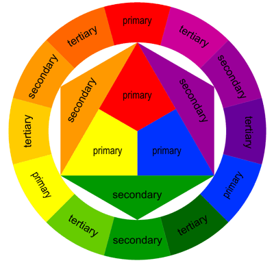
Fig. 35.3 Color wheel using the RGB color model.
Contrast & Accessibility
Color is an important asset in design of Web content, enhancing its aesthetic appeal, its usability, and its accessibility. However, some users have difficulty perceiving color. People with partial sight often experience limited color vision, and many older users do not see color well. In addition, people using text-only, limited-color or monochrome displays and browsers will be unable to access information that is presented only in color.
According to the Web Content Accessibility Guidelines (WCAG), content visible on the Web must meet certain criteria to be considered accessible. For example, here is one criteria governing the minimum color contrast ratio for text:
The visual presentation of text and images of text [must have] a contrast ratio of at least
4.5:1, except for the following:
Large Text: Large-scale text and images of large-scale text have a contrast ratio of at least
3:1;Incidental: Text or images of text that are part of an inactive user interface component, that are pure decoration, that are not visible to anyone, or that are part of a picture that contains significant other visual content, have no contrast requirement.
Logotypes: Text that is part of a logo or brand name has no contrast requirement.
—WCAG 2.1: Success Criterion 1.4.3 Contrast (Minimum)
- contrast ratio
(L1 + 0.05) / (L2 + 0.05), whereL1is the relative luminance of the lighter of the colors, andL2is the relative luminance of the darker of the colors.
- relative luminance
R * 0.2126 + G * 0.7152 + B * 0.0722, whereR,G, andBare the normalized (between 0 and 1) red, green, and blue components of a color in the RGB color model.
The formulas provided above can be tedious to implement correctly in many cases since colors are seen expressed in different ways (hue, RGB value, HSL value, etc.). The “developer mode” of most web browsers can be used to determine contrast ratios for text on a web page. The Contrast Ratio website is also a good option.
Color, Psychology, Emotion, and Culture
Wegman and Said (2011) [color:1] discus how different colors can evoke different emotions or result in different impressions. Here are some mappings drawn from various sources that are primarily based on Western culture:
- urgency
- passion
- heat
- love
- blood
- wealth
- royalty
- sophistication
- intelligence
- spirituality
- truth
- dignity
- power
- coolness
- melancholy
- formality
- death
- rebellion
- strength
- evil*
- emptiness
- lightness
- clean
- honest
- pure*
- warmth
- cowardice
- brightness
- creativity
- cheer
- nature
- health
- money
- cheerfulness
- quality
Remember, the information presented above is based on Western cultures. For example, in many Western cultures, white is associated with purity and hope; however, in some Asian culures, white is associated with death and bad luck.
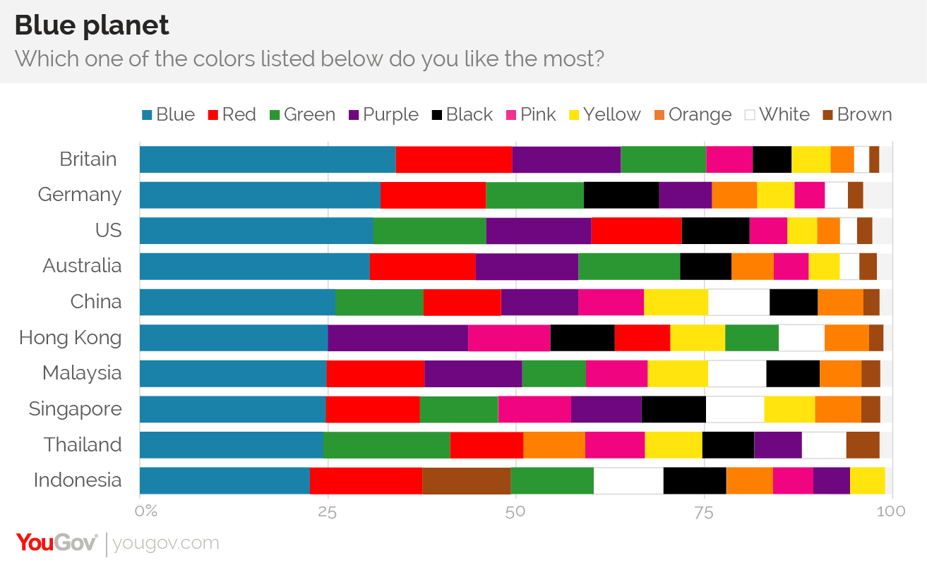
Favorite Color
A survey conducted by YouGov reveals that blue is the most popular color in 10 countries across four continents – including China.
Resources
You may find the following resources useful:
References
- color:1
Edward Wegman and Yasmin Said. Color theory and design. WIREs Computational Statistics, 3(2):104–117, 2011. doi:https://doi.org/10.1002/wics.146.
35.2.1. Participation Activity
Before class tomorrow, individually complete the following activity:
Consider some possible meanings for the terms color win and color fail in the context of user experience design, then find one example of eafch that you have personally encountered in a user interface. You get to define those terms for this activity; however, try to come up with a definition that makes sense in the context of user experience design. After some thought and contemplatation, respond to the following in a followup discussion here.
Color Win
Definition of color win.
Include a picture of a design that exemplifies your definition of a color win.
Provide a brief description of your example, including a justification. Be sure to use terms from color theory whenever possible to help you make your case.
Color Fail
Definition of color fail.
Include a picture of a design that exemplifies your definition of a color win.
Provide a brief description of your example, including a justification. Be sure to use terms from color theory whenever possible to help you make your case.
Comment on another student’s post by replying to their followup discussion.