DDQ TUE 2023-03-21
27. Featuritis
27.1. Agenda
Released |
Category |
Assignment |
Day |
Date |
|---|---|---|---|---|
2023-01-10 |
Term Project |
FRI |
2023-01-20 |
|
2023-01-19 |
Paper Pres. |
THU |
2023-01-26 |
|
2023-01-19 |
Term Project |
Milestone 1: Problem Proposal (Part 1) |
FRI |
2023-01-27 |
2023-01-19 |
Paper Pres. |
THU |
2023-02-09 |
|
2023-01-19 |
Term Project |
Milestone 1: Problem Proposal (Part 2) |
FRI |
2023-02-10 |
2023-02-07 |
Exams |
FRI |
2023-02-10 |
|
2023-02-07 |
Exams |
TUE |
2023-02-14 |
|
2023-02-16 |
Term Project |
FRI |
2023-03-17 |
|
2023-03-20 |
Term Project |
FRI |
2023-04-14 |
|
2023-03-28 |
Exams |
FRI |
2023-04-21 |
|
2023-03-28 |
Exams |
THU |
2023-04-27 |
|
2023-03-28 |
Term Project |
TUE |
2023-05-09 |
General Announcements
Activity
27.2. Activity
27.2.1. Introduction
Understanding Featuritis: Causes, Symptoms, Diagnosis, and Treatment
Non-Medically Reviewed by Michael E. Cotterell, PhD
In every successful product there lurks the carrier of an insidious disease called “featuritis,” with its main symptom being “creeping featurism.”
—Don Norman, The Design of Everyday Things
The word “featuritis” means “feature inflammation,” where inflammation refers to any localized product condition in which part of the product becomes swollen with features, especially as a reaction to industry trends, competition in the marketplace, or even competing requirements. With featuritis, an area in or around an interaction becomes inflamed, causing pain points, user drop off, or even user exit.
- user drop off
A scenario in which a user’s experience with a product deviates from that product’s ideal, planned user experience.
- user exit
A scenario in which a user’s experience with a product leads them to discontinue their use of the product.
Featuritis that lasts a very long time or comes back can directly affect the monetization of a product. Some types of featuritis also affect other parts of a product. For example, in the case of software applications, featuritis can affect the software’s documentation or even the amount of resources needed for the software to run.
About 1 in 5 popular software products may have some form of featuritis
About 1 in 5 popular software products may have some form of featuritis, according to anecdotal evidence ascertained from personal observations1. It can happen to any product, but it becomes more common as the product ages.
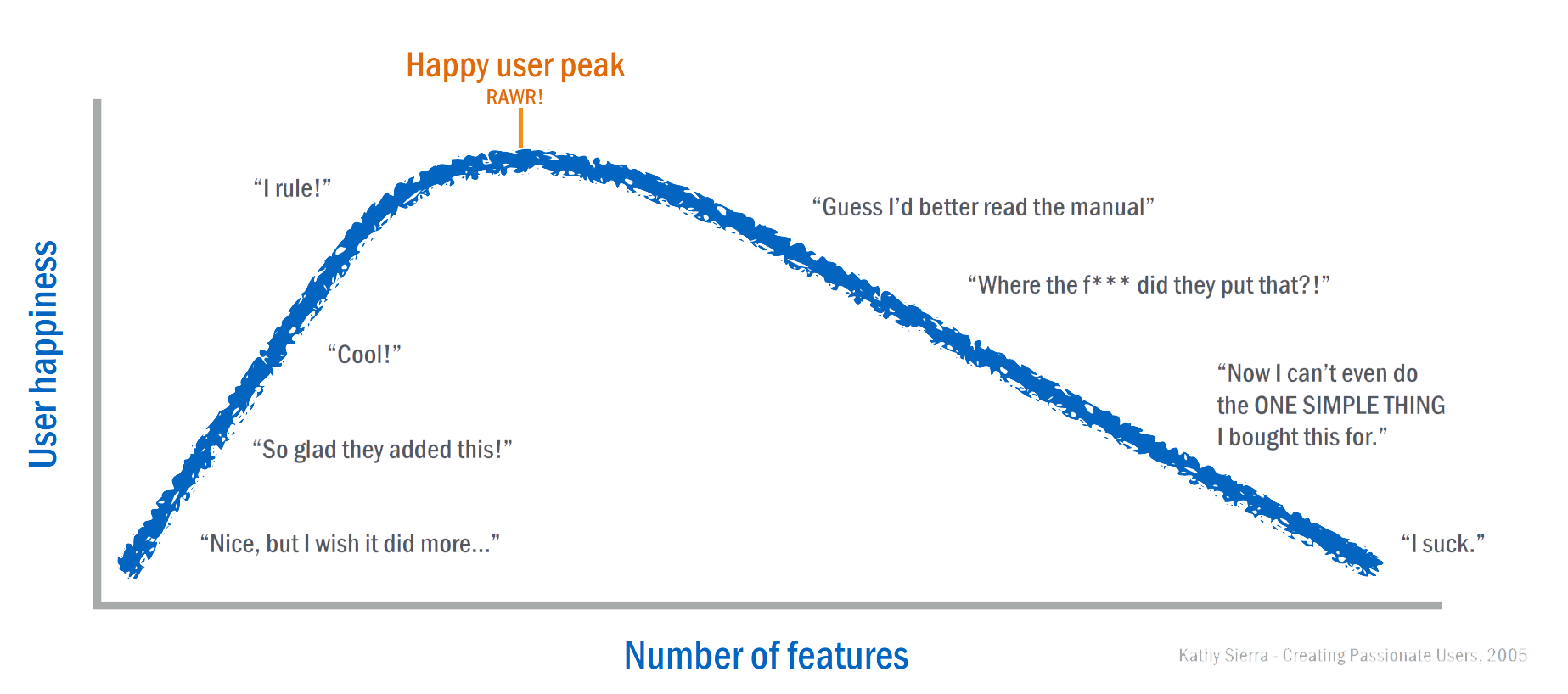
Fig. 27.1 Relationship between user happiness and number of features. – Kathy Sierra, Creating Passionate Users. 2005.
27.2.2. Types of Featuritis
The term can apply to products that offer many poorly designed features instead of fewer well-designed features. It is also commonly applied to software products that exhibit creeping featurism, the phenomenon of not updating the user interface in a software application when new features are added. In the latter case, the creeping featurism results in user experiences that no longer work well because the product’s original design does not accommodate the new features in a way that meets user experience requirements.
27.2.3. What Causes Featuritis?
The cause of some types of featuritis is unknown. Researchers are looking into the role of various stakeholders and other factors like industry trends and competition in the marketplace in the development of featuritis.
27.2.4. Symptoms
Different types of featuritis have different symptoms that can vary in severity from product to product. The addition of features to a product usually creates more choices for a user; however, more choice is not always a good thing – consider Hick’s law:
- Hick’s law
- Hick–Hyman law
Given \(n\) equally probable choices, the average reaction time \(T\) required to choose among the choices is approximately \(T = b \cdot \log_2 \left( n + 1\right)\) where \(b\) is a constant that can be determined empirically by fitting a line to measured data (e.g., using regression).
According to Hick’s law, the time needed for a user to reach a decision grows logarithmically as the number of choices they are presented with increases.
Fig. 27.2 Data from W. E. Hick (1952) demonstrating Hick’s Law: The relationship between reaction time and number of response options across two participants (red and blue). Image Credit: Emily Willoughby.
This adds complexity to user’s experiences with a product. As a result, symptoms of software featuritis, for example, may include feature bloat, low discoverability, and low findability.
27.2.5. How is Featuritis Treated?
The goal of treatment is to provide pain relief, increase usability, and control the condition as much as possible. David Bishop, the Strategic Design Lead for MAYA Design, Inc., has this to say concerning various treatment options:
Designing usable interfaces requires discipline to remove features in some cases, to organize others so they can be found and used, and to shift complexity away from users to more appropriate places.
—David Bishop, “The Theory of Conservation of Complexity” in Interactions. 15(4):61–63, July 2008.
- Remove Features
Remove features that are no longer relevant.
Table 27.1 Examples of strategies to remove features.¶ Strategy
Example
Usage
Remove features that very few users use or that are not used often.
Feedback
Remove features based on feedback.
Legacy Exit
Remove features related to legacy products.
- Organize Features
Organize features in such a way that a user only interacts with them when the feature is relevant.
Table 27.2 Examples of strategies to organize features.¶ Strategy
Example
App-wide Modes
Beginner mode vs. advanced mode, regular mode vs. debug mode (IDEs), etc.
Area-specific Modes
Tabbed toolbars like the “ribbon” in Microsoft Office.
Context-aware
Show formatting options only when some text is selected.
Split
Instead of one app that does A and B, split it into two apps.
- Shift Feature Complexity Away From Users
Shift features in such a way that they no longer require interactions or require fewer interactions.
Table 27.3 Examples of strategies to shift complexity away from users.¶ Strategy
Example
Automation
Tax preparation software that electronically files your tax return.
Manufacturing
The USB-C connector system with a rotationally symmetrical connector.
Email is a collection of conversations (not just dated messages).
27.2.6. Featuritis Outlook
With early diagnosis, most types of featuritis can be managed and its pain and other negative effects minimized. In addition, early diagnosis and treatment may be able to prevent drop off and exit caused by featuritis. Although applicable to all products, an early, aggressive treatment of featuritis is particularly important for products produced by newer, less established companies that cannot yet depend on brand recognition to attract future customers.
27.2.7. Case Study: Microsoft Office
Microsoft Office is a suite of productivity apps and service developed by Microsoft and initially released on November 19, 1990. Over time, it fell ill with featuritis; however, its remarkable recovery and the challenges it faced during that recovery make for an interesting case study on how to deal with feature complexity in popular software that is heavily utilized in businesses around the world.
We got to a point where 10 years after [applications such as Word, Excel and PowerPoint] were released, the applications had 10 times more commands than they had at the beginning.
—Mark Alexieff, a Senior Product Manager for Microsoft Office
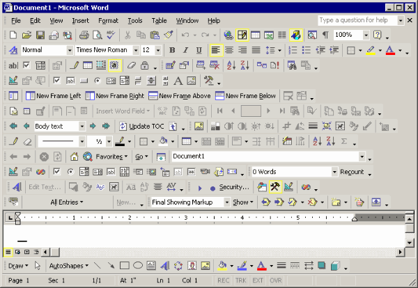
Fig. 27.3 An old version of Microsoft Word (sometime before 2010) with most of the toolbars turned on.
In Office 2007, Microsoft introduced their Fluent UI design into various products within the Microsoft Office suite – the most notable aspect of this design is the “ribbon,” a panel that houses a fixed arrangement of command buttons and icons; it organizes commands as a set of tabs that each centered around some theme or purpose. According to Microsoft2, the “ribbon” in recent versions of Microsoft Office replaces the suite’s previous system of layered menus, toolbars, and task panes that existed in previous versions.
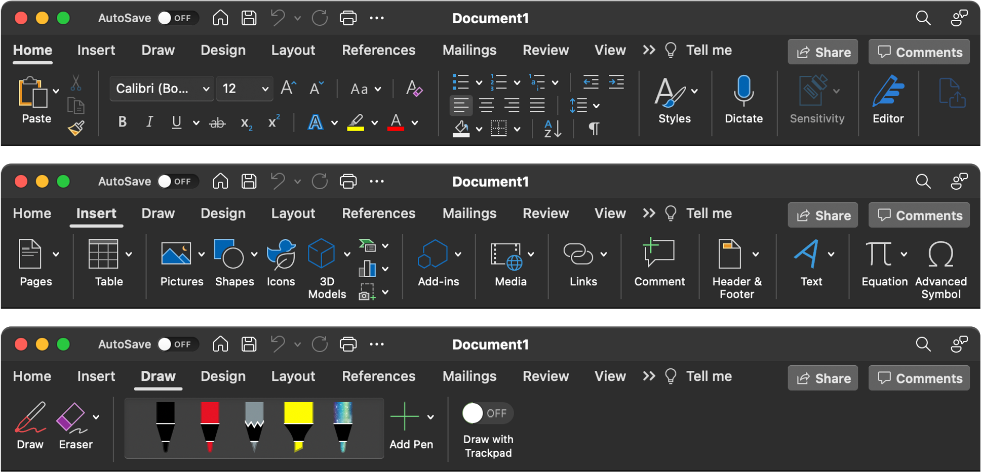
Fig. 27.4 Various tabs of the Fluent UI (i.e., the “ribbon”) interface in a 2020 version of Microsoft Word for Mac.
Although various studies and user feedback collected by Microsoft suggest productivity improvements resulting from the design change, the introduction of the “ribbon” interface was not well-received by all:
I have been trying to learn to use the ribbon, but I am EXTREMELY unhappy with it. I have used Microsoft Word, for example, for over 10 years. I knew how to do EVERYTHING I needed, with keyboard shortcuts or a couple of quick menu clicks. Now I can’t find ANYTHING!! For even simple tasks, I end up searching through different ribbon “groups” over and over again. I lose my train of thought completely, just trying to figure out how to do something simple. THIS IS NOT PRODUCTIVE!!! […] I’d rather fight with my kids for use of the “old” computers just so I can use a decent version of Word.
—Frank Boston in a reply to a post on the Microsoft Office TechCenter Forums, June 14, 2010.
Since Office 2010, the ribbon is included in all programs in the Microsoft Office suite and is fully customizable in the desktop versions of those programs.
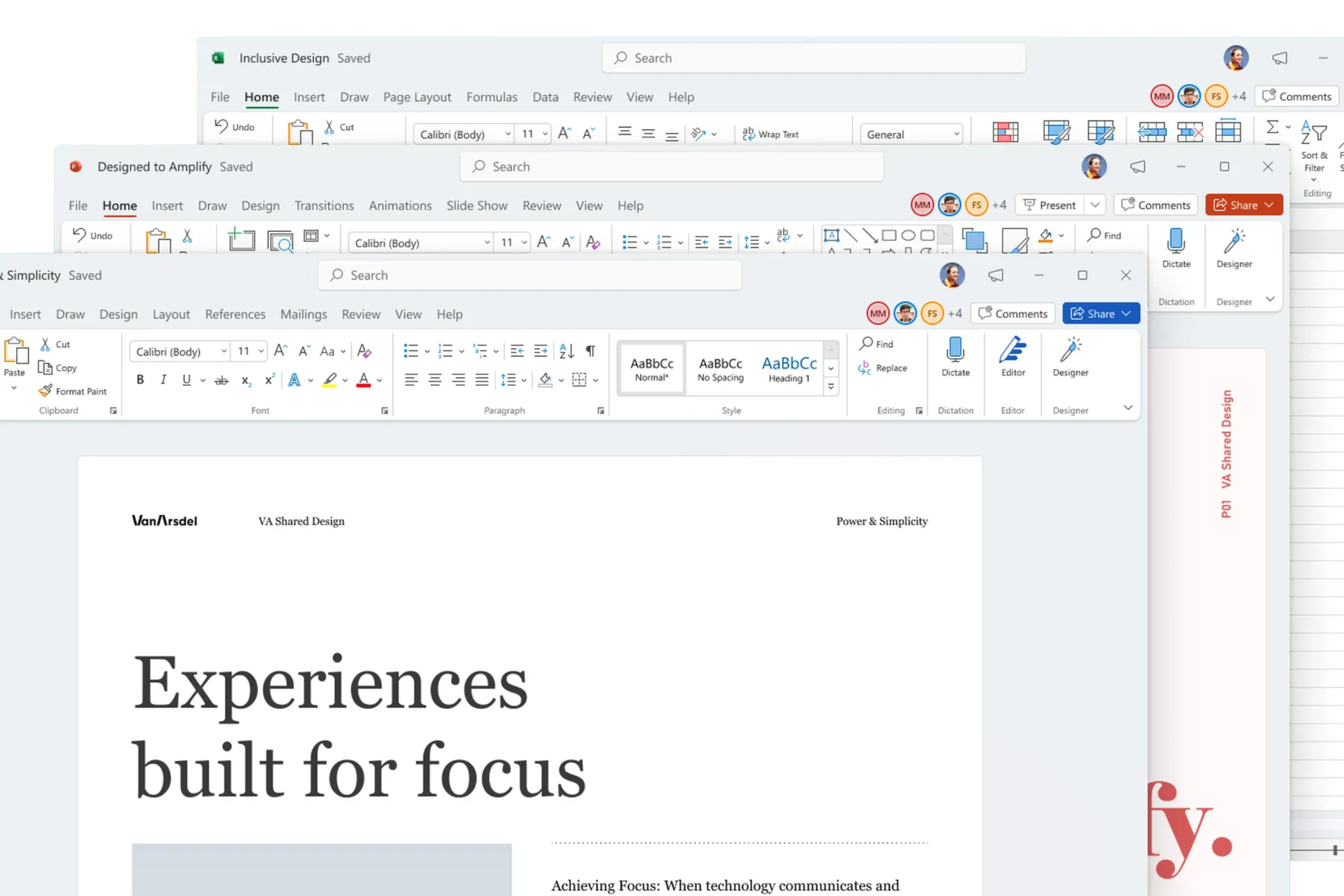
Fig. 27.5 2021 versions of Microsoft Word, Microsoft Excel, and Microsoft PowerPoint on Windows 11, part of a Microsoft Office “visual refresh” that Microsoft announced will also be available to anyone using Windows 10.
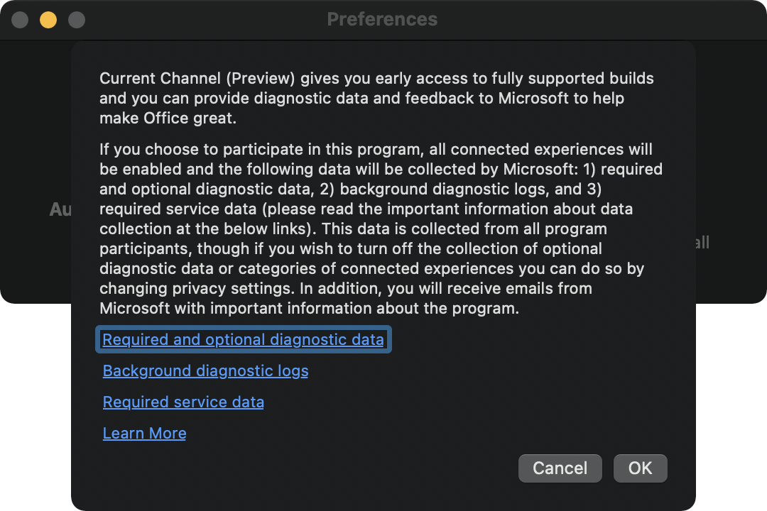
Fig. 27.6 The notice that is shown to users when they attempt to switch their automatic updates in Microsoft Office for Mac to “preview” releases (circa 2021). It outlines how Microsoft collects data about user experiences in order to potentially influence design changes down the road.
Transcription of Figure Fig. 27.6
Current Channel (Preview) gives you early access to fully supported builds
and you can provide diagnostic data and feedback to Microsoft to help
make Office great.

If you choose to participate in this program, all connected experiences will
be enables and the following data will be collected by Microsoft: 1) required
and optional diagnostic data, 2) background diagnostic logs, and 3)
required service data (please read the important information about data
collection at the below links). This data is collected from all program
participants, though if you wish to turn off the collection of optional
diagnostic data or categories of connected experiences you can do so by
changing privacy settings. In addition, you will receive emails from
Microsoft with important information about the program.

Required and optional diagnostic data
Background diagnostic logs
Required service data
Learn More

Cancel OK
27.3. Breakout Groups
Important
This activiy is moved to THU 03-23.
Important
RANDOMIZE: Please move around to different tables and form a random group for this activity.
Quickly introduce yourselves to each other, if you don’t already know each other.
Pick a group representative. This person will be responsible for posting your breakout group’s response on Piazza before breakout group work ends for this activity.
Help your group representative respond to the following in a followup discussion to Piazza @90.
List the names of your breakout group members.
Discuss featuritis, then find an example of an app that your group thinks suffers from featuritis, describe it in your followup discussion, and provide evidence and commentary to support your diagnosis. You may not use any app in Microsoft Office as your example.
Making a Good Diagnosis
A good example of featuritis in some app should include: i) the name of the app, its relevant version number or edition, and the platform (or operating system) it runs on; ii) a description of the app’s features, including how they changed over time, their discoverability, their findability, etc.; and iii) some before and after screenshots.
A really good example of featuritis in some app is grounded in the language of affordances, signifiers, or even the Seven Stages of Action.
Look at and reply to the posts that other groups made.
27.4. After Breakout Groups
N.A.
27.5. After Class
Before the next class period, individually respond to the following prompt in your own followup discussion to Piazza @90.
Prompt
What is an example of an app that you think has experienced featuritis? If possible, provide a before and after screenshot to illustrate your point.
Continue reading the Practicum module.
Read the abstracts for upcoming paper presentations – the schedule can be found here.
Here is a list of current assignments:
Released
Category
Assignment
Day
Date
2023-01-10
Term Project
FRI
2023-01-20
2023-01-19
Paper Pres.
THU
2023-01-26
2023-01-19
Term Project
Milestone 1: Problem Proposal (Part 1)
FRI
2023-01-27
2023-01-19
Paper Pres.
THU
2023-02-09
2023-01-19
Term Project
Milestone 1: Problem Proposal (Part 2)
FRI
2023-02-10
2023-02-07
Exams
FRI
2023-02-10
2023-02-07
Exams
TUE
2023-02-14
2023-02-16
Term Project
FRI
2023-03-17
2023-03-20
Term Project
FRI
2023-04-14
2023-03-28
Exams
FRI
2023-04-21
2023-03-28
Exams
THU
2023-04-27
2023-03-28
Term Project
TUE
2023-05-09
Footnotes
- 1
This DDQ’s “activity” section is written to parody WebMD. As such, many statements in that section are structured in a way that mimics a style of writing that is common to that website. The phrase “[a]bout 1 in 5” is mere conjecture and should not be interpreted as an official statisticp; instead, we ask that you interpret “[a]bout 1 in 5” as “many.”
- 2
Overview of the Office Fluent ribbon. January 2, 2019.
