DDQ THU 2023-02-02
12. Principles & The Golden Rules
12.1. Agenda
Released |
Category |
Assignment |
Day |
Date |
|---|---|---|---|---|
2023-01-10 |
Term Project |
FRI |
2023-01-20 |
|
2023-01-19 |
Paper Pres. |
THU |
2023-01-26 |
|
2023-01-19 |
Term Project |
Milestone 1: Problem Proposal (Part 1) |
FRI |
2023-01-27 |
2023-01-19 |
Paper Pres. |
THU |
2023-02-09 |
|
2023-01-19 |
Term Project |
Milestone 1: Problem Proposal (Part 2) |
FRI |
2023-02-10 |
2023-02-07 |
Exams |
FRI |
2023-02-10 |
|
2023-02-07 |
Exams |
TUE |
2023-02-14 |
|
2023-02-16 |
Term Project |
FRI |
2023-03-17 |
|
2023-03-20 |
Term Project |
FRI |
2023-04-14 |
|
2023-03-28 |
Exams |
FRI |
2023-04-21 |
|
2023-03-28 |
Exams |
THU |
2023-04-27 |
|
2023-03-28 |
Term Project |
TUE |
2023-05-09 |
General Announcements
Activity
12.2. Activity
12.2.1. Introduction
While guidelines are low-level and narrowly focused, principles are more fundamental, widely applicable, and enduring. However, they also tend to need more clarification.
—Shneiderman et al.
Consider the “golden rules” for interface design:
Strive for consistency.
Seek universal usability.
Offer informative feedback.
Design dialogs (or prompts) to yield closure.
Prevent errors.
Permit easy reversal of actions.
Keep users in control.
Reduce short-term memory load.
12.2.2. Strive for consistency.
Consistent sequences of actions should be required in similar situations; identical terminology should be used in prompts, menus, and help screens; and consistent color, layout, capitalization, fonts, and so on, should be employed throughout. Exceptions, such as required confirmation of the delete command or no echoing of passwords, should be comprehensible and limited in number.
—Shneiderman et al. [TB:2]

Fig. 12.1 Material is a an adaptable system of design-related guidelines, components, and tools system created by Google to help teams build high-quality and consistent user experiences for Android, iOS, Flutter, and the web.
12.2.3. Seek universal usability.
Recognize the needs of diverse users and design for plasticity, facilitating transformation of content. Novice to expert differences, age ranges, disabilities, international variations, and technological diversity each enrich the spectrum of requirements that guides design. Adding features for novices, such as explanations, and features for experts, such as shortcuts and faster pacing, enriches the interface design and improves perceived quality.
—Shneiderman et al. [TB:2]
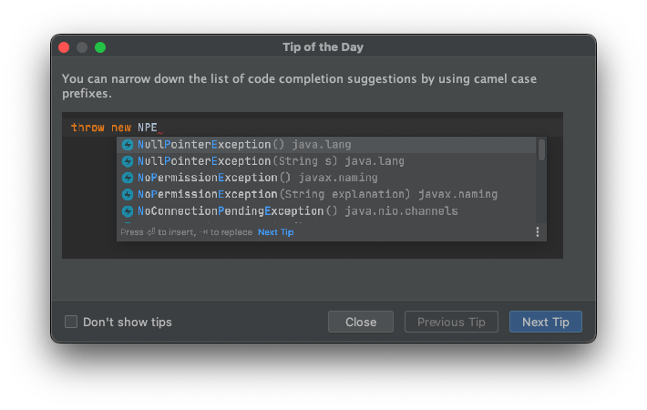
Fig. 12.2 IntelliJ IDEA includes a “Tip of the Day” dialog that provide a collection of useful and interesting hints. The dialog is shown every time a user starts IntelliJ IDEA, unless it has been disabled by the user (e.g., by selecting “Don’t show tips” or adjusting some setting).
12.2.4. Offer informative feedback.
For every user action, there should be an interface feedback. For frequent and minor actions, the response can be modest, whereas for infrequent and major actions, the response should be more substantial. Visual presentation of the objects of interest provides a convenient environment for showing changes explicitly (see the discussion of direct manipulation in Chapter 7).
—Shneiderman et al. [TB:2]
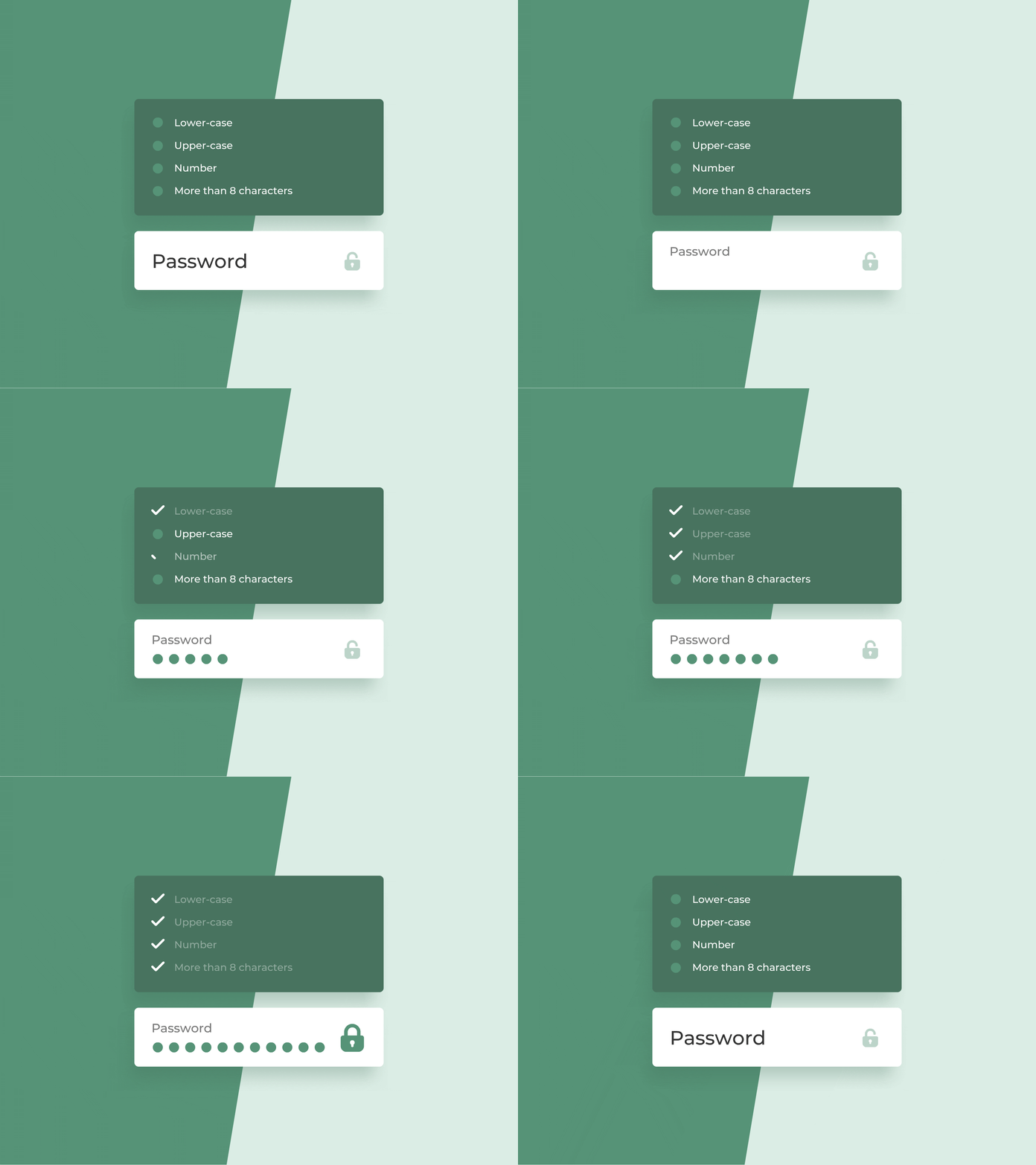
Fig. 12.3 In many apps, password fields obscure or hide their input; however, they also require passwords to meet certain requirements for security purposes. If a user cannot see the password that they typed, it is harder for them to fix a password when those requirements are not met. Instead of making the password input visible, many password validators provide feedback to users as they type. This example was designed by Neven Solidov.
12.2.5. Design dialogs (or prompts) to yield closure.
Sequences of actions should be organized into groups with a beginning, middle, and end. Informative feedback at the completion of a group of actions gives users the satisfaction of accomplishment, a sense of relief, a signal to drop contingency plans from their minds, and an indicator to prepare for the next group of actions. For example, e-commerce websites move users from selecting products to the checkout, ending with a clear confirmation page that completes the transaction.
—Shneiderman et al. [TB:2]
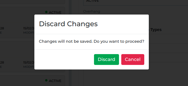
Fig. 12.4 This simple example of a dialog communicates: i) the reason the app engaged the user in the dialog; ii) the different closure paths; and iii) the impact of taking each path.
12.2.6. Prevent errors.
As much as possible, design the interface so that users cannot make serious errors; for example, gray out menu items that are not appropriate and do not allow alphabetic characters in numeric entry fields (Section 3.3.5). If users make an error, the interface should offer simple, constructive, and specific instructions for recovery. For example, users should not have to retype an entire name-address form if they enter an invalid zip code but rather should be guided to repair only the faulty part. Erroneous actions should leave the interface state unchanged, or the interface should give instructions about restoring the state.
—Shneiderman et al. [TB:2]
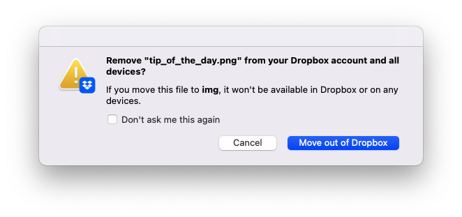
Fig. 12.5 Dropbox helps prevent users from encountering potential errors that might arise if they move a file out their Dropbox folder, making it unavailable to other devices that my be using the file.
12.2.7. Permit easy reversal of actions.
As much as possible, actions should be reversible. This feature relieves anxiety, since users know that errors can be undone, and encourages exploration of unfamiliar options. The units of reversibility may be a single action, a data-entry task, or a complete group of actions, such as entry of a name-address block.
—Shneiderman et al. [TB:2]

Fig. 12.6 Make a typo in your email? Forget to add a recipient? Change your mind about sending an email? Gmail lets users take back an email they just sent via their “Undo Send” feature.
12.2.8. Keep users in control.
Experienced users strongly desire the sense that they are in charge of the interface and that the interface responds to their actions. They don’t want surprises or changes in familiar behavior, and they are annoyed by tedious data-entry sequences, difficulty in obtaining necessary information, and inability to produce their desired result.
—Shneiderman et al. [TB:2]
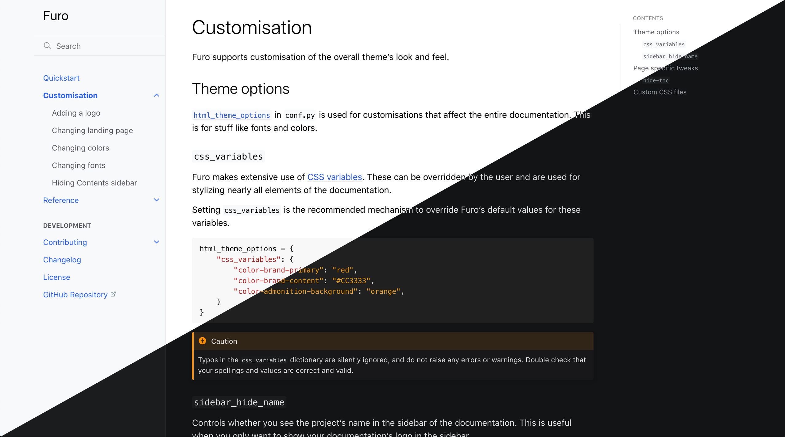
Fig. 12.7 Many apps provide a way for users to change the appearance of dialogs, buttons, and other visual elements of their user interface. This example showcases @pradyunsg’s Furo, a theme for Sphinx that provides a “dark mode” and “light mode” that users can choose, depending on their preference.
12.2.9. Reduce short-term memory load.
Humans’ limited capacity for information processing in short-term memory (the rule of thumb is that people can remember “seven plus or minus two chunks” of information) requires that designers avoid interfaces in which users must remember information from one display and then use that information on another display. It means that cellphones should not require reentry of phone numbers, website locations should remain visible, and lengthy forms should be compacted to fit a single display.
—Shneiderman et al. [TB:2]
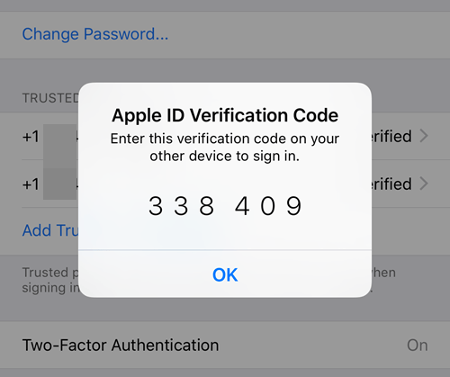
Fig. 12.8 Whenever an Apple ID is used to sign in to an app or service on a new device, a short verification code is displayed on existing, trusted devices that must be entered on the new device.
12.2.10. Breakout Groups
N/A. There is no in-class breakout group portion for today’s DDQ.
12.2.11. After Class
Before SAT 02-04 @ 11:55PM, create a followup discussion in Piazza @46 (instructions below), and before class on TUE 04-07, comment on one or more posts made by another student by replying to their followup discussion(s) in Piazza @46.
Note
Please wait until SUN morning to provide your comments to others so that everyone has an equal opportunity to receive a reply.
Use the last digit of your nine-digit 81x number and the table below to determine which principle you are assigned for this after class activity.
#
Principle
Last Digit of 81x Number
1
Strive for consistency.
0, 8
2
Seek universal usability.
1
3
Offer informative feedback.
2, 9
4
Design dialogs (or prompts) to yield closure.
3
5
Prevent errors.
4
6
Permit easy reversal of actions.
5
7
Keep users in control.
6
8
Reduce short-term memory load.
7
Before SAT 02-04 @ 11:55PM, create a folloup discussion in Piazza @46 that answers the following questions:
What principle were you assigned?
Based on your own experiences, what are some things that might get in the way of achieving or implementing your principle?
What are two or three examples of human-computer interfaces that you believe exemplify your assigned principle? You should include pictures and a short justification for each example.
Before class on TUE 04-07, individually comment on one or more posts made by students assigned a different principle than the one you were assigned by replying to their followup discussion in Piazza @46.
Finish reading the Foundations module, and continue reading the Usability module.
Here is a list of current assignments:
Released
Category
Assignment
Day
Date
2023-01-10
Term Project
FRI
2023-01-20
2023-01-19
Paper Pres.
THU
2023-01-26
2023-01-19
Term Project
Milestone 1: Problem Proposal (Part 1)
FRI
2023-01-27
2023-01-19
Paper Pres.
THU
2023-02-09
2023-01-19
Term Project
Milestone 1: Problem Proposal (Part 2)
FRI
2023-02-10
2023-02-07
Exams
FRI
2023-02-10
2023-02-07
Exams
TUE
2023-02-14
2023-02-16
Term Project
FRI
2023-03-17
2023-03-20
Term Project
FRI
2023-04-14
2023-03-28
Exams
FRI
2023-04-21
2023-03-28
Exams
THU
2023-04-27
2023-03-28
Term Project
TUE
2023-05-09

Comments
Please keep the comments polite and constructive. In addition to whatever else you want to write, please comment on one aspect of a group’s post that you like and one aspect that you think needs improvement (e.g., you find that something is unclear or you don’t understand a justification). Be sure to provide a brief justification for each.